
Popularity
5.5
Growing
Activity
7.1
Declining
704
15
134
Monthly Downloads: 0
Programming language: TypeScript
License: MIT License
Latest version: v5.8.1
rsuite-table alternatives and similar libraries
Based on the "Table / Data Grid" category.
Alternatively, view rsuite-table alternatives based on common mentions on social networks and blogs.
-
AG Grid
The best JavaScript Data Table for building Enterprise Applications. Supports React / Angular / Vue / Plain JavaScript. -
-
fixed-data-table
DISCONTINUED. A React table component designed to allow presenting thousands of rows of data. -
Glide Data Grid
🚀 Glide Data Grid is a no compromise, outrageously react fast data grid with rich rendering, first class accessibility, and full TypeScript support. -
-
react-pivot
React-Pivot is a data-grid component with pivot-table-like functionality for data display, filtering, and exploration. -
-
-
ka-table
Lightweight MIT React Table component with Sorting, Filtering, Grouping, Virtualization, Editing and many more -
react-tabulator
React Tabulator is based on tabulator - a JS table library with many advanced features. -
-
gigatables-react
GigaTables is a ReactJS plug-in to help web-developers process table-data in applications and CMS, CRM, ERP or similar systems.


SurveyJS - Open-Source JSON Form Builder to Create Dynamic Forms Right in Your App
With SurveyJS form UI libraries, you can build and style forms in a fully-integrated drag & drop form builder, render them in your JS app, and store form submission data in any backend, inc. PHP, ASP.NET Core, and Node.js.
Promo
surveyjs.io


Do you think we are missing an alternative of rsuite-table or a related project?


README
rsuite-table
A React table component.


Features
- Support virtualized.
- Support fixed header, fixed column.
- Support custom adjustment column width.
- Support for custom cell content.
- Support for displaying a tree form.
- Support for sorting.
- Support for expandable child nodes
- Support for RTL
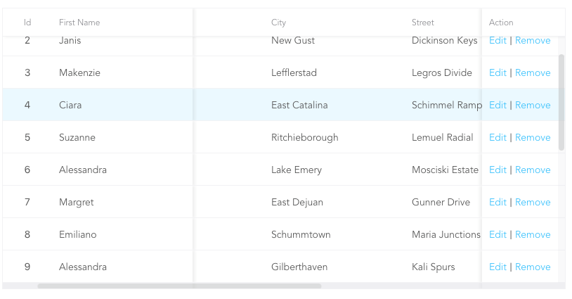
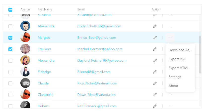
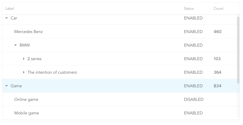
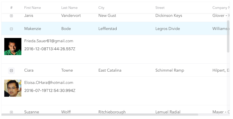
Preview
- Fixed Column
- Custom Cell
- Tree Table
- Expandable
Install
npm i rsuite-table --save
Usage
import { Table, Column, HeaderCell, Cell } from 'rsuite-table';
import 'rsuite-table/lib/less/index.less'; // or 'rsuite-table/dist/css/rsuite-table.css'

const dataList = [
  { id: 1, name: 'a', email: '[email protected]', avartar: '...' },
  { id: 2, name: 'b', email: '[email protected]', avartar: '...' },
  { id: 3, name: 'c', email: '[email protected]', avartar: '...' }
];

const ImageCell = ({ rowData, dataKey, ...rest }) => (
  <Cell {...rest}>
    <img src={rowData[dataKey]} width="50" />
  </Cell>
);

const App = () => (
  <Table data={dataList}>
    <Column width={100} sortable fixed resizable>
      <HeaderCell>ID</HeaderCell>
      <Cell dataKey="id" />
    </Column>

    <Column width={100} sortable resizable>
      <HeaderCell>Name</HeaderCell>
      <Cell dataKey="name" />
    </Column>

    <Column width={100} sortable resizable>
      <HeaderCell>Email</HeaderCell>
      <Cell>
        {(rowData, rowIndex) => {
          return <a href={`mailto:${rowData.email}`}>{rowData.email}</a>;
        }}
      </Cell>
    </Column>

    <Column width={100} resizable>
      <HeaderCell>Avartar</HeaderCell>
      <ImageCell dataKey="avartar" />
    </Column>
  </Table>
);
API
<Table>
| Property | Type (Default) |
Description |
|---|---|---|
| affixHeader | boolean,number | Affix the table header to the specified position on the page |
| affixHorizontalScrollbar | boolean,number | Affix the table horizontal scrollbar to the specified position on the page |
| autoHeight | boolean | The height of the table will be automatically expanded according to the number of data rows, and no vertical scroll bar will appear |
| bordered | boolean | Show border |
| cellBordered | boolean | Show cell border |
| data * | object[] | Table data |
| defaultExpandAllRows | boolean | Expand all nodes By default |
| defaultExpandedRowKeys | string[] | Specify the default expanded row by rowkey |
| defaultSortType | enum: 'desc', 'asc' | Sort type |
| expandedRowKeys | string[] | Specify the default expanded row by rowkey (Controlled) |
| fillHeight | boolean | Force the height of the table to be equal to the height of its parent container. Cannot be used together with autoHeight. |
| headerHeight | number(40) |
Table Header Height |
| height | number(200) |
Table height |
| hover | boolean (true) |
The row of the table has a mouseover effect |
| isTree | boolean | Show as Tree table |
| loading | boolean | Show loading |
| locale | object: { emptyMessage: ('No data'), loading: ('Loading...') } |
Messages for empty data and loading states |
| minHeight | number (0) |
Minimum height |
| onExpandChange | (expanded:boolean,rowData:object)=>void | Tree table, the callback function in the expanded node |
| onRowClick | (rowData:object, event: SyntheticEvent)=>void | Click the callback function after the row and return to rowDate |
| onRowContextMenu | (rowData:object, event: SyntheticEvent)=>void | Invoke the callback function on contextMenu and pass the rowData |
| onScroll | (scrollX:object, scrollY:object)=>void | Callback function for scroll bar scrolling |
| onSortColumn | (dataKey:string, sortType:string)=>void | Click the callback function of the sort sequence to return the value sortColumn, sortType |
| renderEmpty | (info: React.ReactNode) => React.ReactNode | Customized data is empty display content |
| renderLoading | (loading: React.ReactNode) => React.ReactNode | Customize the display content in the data load |
| renderRow | (children?: ReactNode, rowData?: RowDataType) => ReactNode | Custom row element |
| renderRowExpanded | (rowDate?: Object) => React.ReactNode | Customize what you can do to expand a zone |
| renderTreeToggle | (icon:node,rowData:object,expanded:boolean)=> node | Tree table, the callback function in the expanded node |
| rowClassName | string , (rowData:object)=>string | Add an optional extra class name to row |
| rowExpandedHeight | number (100) |
Set the height of an expandable area |
| rowHeight | number(46), (rowData: object) => number |
Row height |
| rowKey | string ('key') |
Each row corresponds to the unique key in data |
| rtl | boolean | Right to left |
| shouldUpdateScroll | boolean,(event)=>({x,y}) (true) |
Use the return value of shouldUpdateScroll to determine whether to update the scroll after the table size is updated. |
| showHeader | boolean (true) |
Display header |
| sortColumn | string | Sort column name ˝ |
| sortType | enum: 'desc', 'asc' | Sort type (Controlled) |
| virtualized | boolean | Effectively render large tabular data |
| width | number | Table width |
| wordWrap | boolean,'break-all','break-word','keep-all' | Whether to appear line breaks where text overflows its content box. |
<Column>
| Property | Type (Default) |
Description |
|---|---|---|
| align | enum: 'left','center','right' | Alignment |
| colSpan | number | Merges column cells to merge when the dataKey value for the merged column is null or undefined. |
| fixed | boolean, 'left', 'right' | Fixed column |
| flexGrow | number | Set the column width automatically adjusts, when set flexGrow cannot set resizable and width property |
| minWidth | number(200) |
When you use flexGrow, you can set a minimum width by minwidth |
| onResize | (columnWidth?: number, dataKey?: string) => void | Callback after column width change |
| resizable | boolean | Customizable Resize Column width |
| rowSpan | (rowData: any) => number | Merges rows on the specified column. |
| sortable | boolean | Sortable |
| treeCol | boolean | A column of a tree. |
| verticalAlign | enum: 'top', 'middle', 'bottom' | Vertical alignment |
| width | number | Column width |
| fullText | boolean | Whether to display the full text of the cell content when the mouse is hovered |
sortableis used to define whether the column is sortable, but depending on whatkeysort needs to set adataKeyinCell. The sort here is the service-side sort, so you need to handle the logic in the ' Onsortcolumn ' callback function of<Table>, and the callback function returnssortColumn,sortTypevalues.
<ColumnGroup>
| Property | Type (Default) |
Description |
|---|---|---|
| align | enum: 'left','center','right' | Alignment |
| fixed | boolean, 'left', 'right' | Fixed column |
| groupHeaderHeight | number | The height of the header of the merged cell group. The default value is 50% of the table headerHeight |
| header | React.ReactNode | Group header |
| verticalAlign | enum: 'top', 'middle', 'bottom' | Vertical alignment |
<HeaderCell>
| Property | Type (Default) |
Description |
|---|---|---|
| children | React.ReactNode | The table column header displays the content |
| renderSortIcon | (sortType) => React.ReactNode | Custom render sort icons on column headers |
<Cell>
| Property | Type (Default) |
Description |
|---|---|---|
| dataKey | string | Data binding key, but also a sort of key |
| rowData | object | Row data |
| rowIndex | number | Row number |
There are three ways to use <Cell>, as follows:
- 1.Associate the fields in the data with
dataKey.
<Column width="{100}" align="center">
  <HeaderCell>Name</HeaderCell>
  <Cell dataKey="name" />
</Column>
- 2.Customize a
<Cell>.
const NameCell = ({ rowData, ...props }) => (
  <Cell {...props}>
    <a href={`mailto:${rowData.email}`}>{rowData.name}<a>
  </Cell>
);

<Column width={100} align="center">
  <HeaderCell>Name</HeaderCell>
  <NameCell />
</Column>
- 3.Customize functions directly within the
<Cell>.
<Column width={100} align="center">
  <HeaderCell>Name</HeaderCell>
  <Cell>
    {(rowData, rowIndex) => {
      return <a href={`mailto:${rowData.email}`}>{rowData.name}</a>;
    }}
  </Cell>
</Column>
(For nested data read this: https://github.com/rsuite/rsuite-table/issues/158)
Methods
- scrollTop(top:number = 0)
- scrollLeft(left:number = 0)