react-sparklines alternatives and similar libraries
Based on the "Chart" category.
Alternatively, view react-sparklines alternatives based on common mentions on social networks and blogs.


SurveyJS - Open-Source JSON Form Builder to Create Dynamic Forms Right in Your App


* Code Quality Rankings and insights are calculated and provided by Lumnify.
They vary from L1 to L5 with "L5" being the highest.
Do you think we are missing an alternative of react-sparklines or a related project?


README
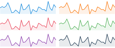
Beautiful and expressive sparklines component for React

Live demos and docs: borisyankov.github.io/react-sparklines/

Install
npm install react-sparklines --save
Run demo
npm install
npm start
http://localhost:8080
Use
Import the Sparklines components that you need; for example to generate a simple chart:

import React from 'react';
import { Sparklines } from 'react-sparklines';
...
<Sparklines data={[5, 10, 5, 20, 8, 15]} limit={5} width={100} height={20} margin={5}>
</Sparklines>
Sparklines component is a container with the following properties:
data - the data set used to build the sparkline
limit - optional, how many data points to display at once
width, height - dimensions of the generated sparkline in the SVG viewbox. This will be automatically scaled (i.e. responsive) inside the parent container by default.
svgWidth, svgHeight - If you want absolute dimensions instead of a responsive component set these attributes.
preserveAspectRatio - default: 'none', set this to modify how the sparkline should scale
margin - optional, offset the chart
min, max - optional, bound the chart
Basic Sparkline
import React from 'react';
import { Sparklines, SparklinesLine } from 'react-sparklines';
...
<Sparklines data={[5, 10, 5, 20]}>
  <SparklinesLine color="blue" />
</Sparklines>
Bars
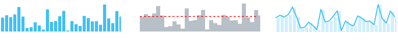
import React from 'react';
import { Sparklines, SparklinesBars } from 'react-sparklines';
...
<Sparklines data={[5, 10, 5, 20]}>
  <SparklinesBars />
</Sparklines>
Spots

import React from 'react';
import { Sparklines, SparklinesLine, SparklinesSpots } from 'react-sparklines';
...
<Sparklines data={sampleData}>
    <SparklinesLine style={{ fill: "none" }} />
    <SparklinesSpots />
</Sparklines>
Reference Line
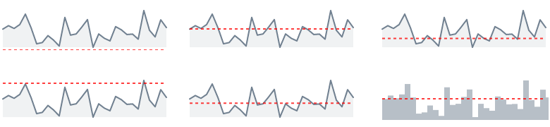
import React from 'react';
import { Sparklines, SparklinesLine, SparklinesReferenceLine } from 'react-sparklines';
...
<Sparklines data={sampleData}>
    <SparklinesLine />
    <SparklinesReferenceLine type="mean" />
</Sparklines>
Normal Band
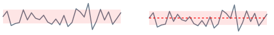
import React from 'react';
import { Sparklines, SparklinesLine, SparklinesNormalBand } from 'react-sparklines';
...
<Sparklines data={sampleData}>
    <SparklinesLine style={{ fill: "none" }}/>
    <SparklinesNormalBand />
</Sparklines>